Prediction
This section continues on from the end of the previous section on the updated model.
By default, we can easily calculate the predicted values for the left-hand-side dependent variable. In our case, we have created a model for \(\log(wage)\), so we can calculate \(\widehat{\log(wage)}\) as follows:
predict_log_wage_train = mdl_4.predict(exog = dt_train)
predict_log_wage_test = mdl_4.predict(exog = dt_test)
In order to get the prediction for \(wage\) - we need to take the exponent of \(\widehat{\log(wage)}\):
We are not limited to using training and test sets - we create forecasts for specific explanatory variable values, which we may not directly have in our dataset. For example, we can take the mean of continuous variables and the median for the indicator variables:
#
dt_custom = pd.concat([dt_train[['educ', 'exper']].mean(),\
                       dt_train[['metro', 'female']].median()])
dt_custom = pd.DataFrame(dt_custom)
dt_custom = dt_custom.T
print(dt_custom)
educ exper metro female
0 14.186458 23.413542 1.0 0.0Consequently, the predicted wage for this type of “average” individual is:
Since we have both the training and test sets - we can compare the actual values with the predicted ones:
pd.concat([dt_train["wage"], predict_wage_train], axis = 1,
          ignore_index = True).set_axis(labels = ['actual','predicted'], axis = 1).head(10)
actual predicted
0 44.44 17.502749
1 16.00 19.539269
2 15.38 31.537529
3 13.54 20.965706
4 25.00 17.978159
5 24.05 24.588076
6 40.95 20.273622
7 26.45 27.681926
8 30.76 56.359195
9 34.57 16.963232pd.concat([dt_test["wage"], predict_wage_test], axis = 1,
ignore_index = True).set_axis(labels = ['actual','predicted'], axis = 1).head(10) actual predicted
0 27.00 18.932887
1 24.00 15.535581
2 9.00 13.971746
3 7.57 9.897268
4 8.00 10.544873
5 16.25 16.383420
6 18.00 19.809756
7 11.00 24.588076
8 18.50 17.150791
9 10.00 16.467806Comparing these values will tell us whether our specified model is adequate or not. Furthermore, an adequate model should exhibit similar accuracy both in-sample (training set) and out-of-sample (test set) - otherwise there is a risk that our model may overfit on the training set1.
Note that from the linear regression equation: \[ Y_i = \hat{Y}_i + \hat{e}_i = \hat{\beta}_0 + \hat{\beta}_1 X_{1,i} + \dots + \hat{\beta}_k X_{k,i} + \hat{e}_i \] We can decompose \(Y_i\) into its additive components:
- \(\hat{\beta}_j X_{j,i}\) shows the effect (i.e. the contribution) of \(X_{j, i}\) on \(Y_i\),
- \(\hat{e}_i\) shows how much of \(\hat{Y}_i\) remains unexplained by our model.
We decompose the individual fitted values and predictions as follows (note that the decomposition is done on the transformed dependent variable values, i.e. on \(\log(Y)\):
# Fitted values:
fit_decomp <- sweep(model.matrix(mdl_4), MARGIN = 2, STATS = coef(mdl_4), FUN = `*`)
fit_decomp <- cbind(fit_decomp,  error = residuals(mdl_4),
                    fitted = fitted(mdl_4),
                    actual = fitted(mdl_4) + residuals(mdl_4),
                    obs = 1:nrow(fit_decomp)) %>% as_tibble()
# Forecasts:
forc_decomp <- sweep(model.matrix(formula(mdl_4), data = dt_test),
                     MARGIN = 2, STATS = coef(mdl_4),
                     FUN = `*`)
forc_decomp <- cbind(forc_decomp, forecast = predict(mdl_4, newdata = dt_test),
                     obs = 1:nrow(forc_decomp)) %>% as_tibble()
# Fitted values:
fit_decomp = pd.DataFrame(mdl_4_spec.exog * np.array(mdl_4.params), columns = mdl_4_spec.exog_names)
fit_decomp["error"] = mdl_4.resid
fit_decomp["fitted"] = mdl_4.fittedvalues
fit_decomp["actual"] = mdl_4_spec.endog
fit_decomp["obs"] = list(range(0, len(fit_decomp.index)))
# Forecasts:
forc_decomp = pd.DataFrame(
patsy.dmatrices(mdl_4_spec.formula, data = dt_test, return_type = 'matrix')[1] * np.array(mdl_4.params),
columns = mdl_4_spec.exog_names)
forc_decomp["forecast"] = mdl_4.predict(exog = dt_test)
forc_decomp["obs"] = list(range(0, len(forc_decomp.index)))We can then take a few observations and plot their fitted value decompositions:
p1 <- fit_decomp[1:4, ] %>%
  pivot_longer(cols = c(-obs, -fitted, -actual), names_to = "variable", values_to = "value") %>%
  ggplot(aes(x = obs, y = value, fill = variable)) +
  geom_bar(position="stack", stat="identity") + theme_bw() +
  geom_hline(yintercept = 0, color = "black", linetype = "dashed") +
  geom_point(aes(y = actual, color = "actual", shape = "actual"), size = 4) +
  geom_point(aes(y = fitted, color = "fitted", shape = "fitted"), size = 4) +
  scale_fill_manual(values = c("(Intercept)" = "gold", "error" = "red",
                               "educ" = "seagreen3", "I(educ^2)" = "seagreen",
                               "exper" = "skyblue1", "I(exper^2)" = "royalblue",
                               "metro" = "orchid", "female" = "salmon")) +
  scale_color_manual(values = c("actual" = "black", "fitted" = "gray50")) +
  scale_shape_manual(values = c("actual" = "x", "fitted" = "o"))
print(p1)
p1 = fit_decomp.iloc[:4, ].melt(id_vars = ['obs', 'actual', 'fitted'], var_name = "variable")
p1 = (pl.ggplot(data = p1, mapping = pl.aes(x = 'obs', y = 'value', fill = 'variable')) +\
  pl.geom_bar(position="stack", stat="identity") + pl.theme_bw() +\
  pl.geom_hline(yintercept = 0, color = "black", linetype = "dashed") +\
  pl.geom_point(pl.aes(y = "actual", color = "'actual'", shape = "'actual'"), size = 4) +\
  pl.geom_point(pl.aes(y = "fitted", color = "'fitted'", fill = "'fitted'", shape = "'fitted'"), size = 4) +\
  pl.scale_fill_manual(values = {"Intercept": "gold", "error": "red",\
                                 "educ": "limegreen", "np.power(educ, 2)": "seagreen", \
                                 "exper": "skyblue", "np.power(exper, 2)": "royalblue",\
                                 "metro": "orchid", "female": "salmon", "fitted": "none"}) +\
  pl.scale_color_manual(values = {"actual": "black", "fitted": "gray"}) +\
  pl.scale_shape_manual(values = {"actual": "x", "fitted": "o"}))
print(p1)
When plotting the forecasts we usually don’t have the actual values to compare to (and hence, no ‘error’ term):
p2 <- forc_decomp[1:4, ] %>%
  pivot_longer(cols = c(-obs, -forecast), names_to = "variable", values_to = "value") %>%
  ggplot(aes(x = obs, y = value, fill = variable)) +
  geom_bar(position="stack", stat="identity") + theme_bw() +
  geom_hline(yintercept = 0, color = "black", linetype = "dashed") +
  geom_point(aes(y = forecast, color = "forecast"), size = 4, shape = "*") +
  scale_fill_manual(values = c("(Intercept)" = "gold",
                               "educ" = "seagreen3", "I(educ^2)" = "seagreen",
                               "exper" = "skyblue1", "I(exper^2)" = "royalblue",
                               "metro" = "orchid", "female" = "salmon")) +
  scale_color_manual(values = c("forecast" = "black"))
print(p2)
p2 = forc_decomp.iloc[:4, ].melt(id_vars = ['obs', 'forecast'], var_name = "variable")
p2 = (pl.ggplot(data = p2, mapping = pl.aes(x = 'obs', y = 'value', fill = 'variable')) +\
  pl.geom_bar(position="stack", stat="identity") + pl.theme_bw() +\
  pl.geom_hline(yintercept = 0, color = "black", linetype = "dashed") +\
  pl.geom_point(pl.aes(y = "forecast", color = "'forecast'", fill = "'forecast'"), size = 4, shape = '*') +\
  pl.scale_fill_manual(values = {"Intercept": "gold", \
                                 "educ": "limegreen", "np.power(educ, 2)": "seagreen", \
                                 "exper": "skyblue", "np.power(exper, 2)": "royalblue",\
                                 "metro": "orchid", "female": "salmon", "forecast": "black"}) +\
  pl.scale_color_manual(values = {"forecast": "black"}))
print(p2)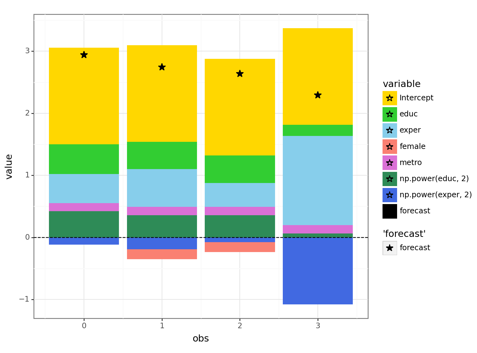
Looking at the decomposition for the the 4th person, we see that the positive effect of having a lot of experience (light blue area - positive value) is partially offset by the dampening effect that’s based on the magnitude of the experience (dark blue area - negative value) due to the negative2 coefficient of \(\rm exper^2\).
Cases where the model fits better on the training set (compared to the test set) can be attributed to either randomness, or a poor choice of a test set.↩︎
Since having a lot of experience is likely to be positively correlated with age - the squared value of experience may act as a sort of proxy for age and thus may result in the negative coefficient value for the squared term of experience.↩︎